5 Common Website Elements that will Engage and Convert Visitors
Engage & Convert Better
Like most teams in the online marketing industry, it’s common to source other business sites for ideas and elements that seem like a good idea. We also identify UX that we can’t stand and features that seem too complicated to use.
And of course, we look for elements that we can assimilate and for moments that make us wonder, ‘Why did they do that and how can we avoid doing the same on our site?’
Working in an industry with fierce competition and high expectations has taught us that not every website element has the power to change the online results for your company, but there are holy-grail website features on every site that can literally help make a sale, capture a lead and/or drive more content engagement.
In the online business you don’t necessarily need to be a marketing genius to convince your website visitors that your product is great. You simply need to better focus visitor attention on what’s already there and integrated into your website.
Per our research with customers, we’ve maintained a finite list of five elements that are common and usually can’t be touched without an absurd amount of hesitation, multiple opinions and tons of research from the team. As a result, you have make these core elements as effective as possible from the start and then further optimize once in place.
1. A pricing page that actually gives you ‘Pricing Information’!
The answer lies in every drop off at a pricing page, clearly in search of something you can’t find, going back and forth from the ‘contact us’ page, not wanting to contact someone for information that should be readily available.
The pricing page should be the most clear and discernible part of your website. Differentiate your plans and prices and don’t drown your guests in unneeded information. No fluff, no animations, just give them a flat and to the point delineation of the different features and advantages they’ll get from each of your pricing options.
What Zendesk succeeds in, as shown in the image above, is simplicity in the face of multiple offers. Not only do they have five plans to choose from, but they are also offering their customers live chat and a 30 day free trial. In other words, they combated the complexity of seven-plus CTA’s with clarity and directness.

While keeping your visuals clean and simple is key, your pricing page is THE place to bulk up on your live chat. One study by Forrester Research found that “44% of online consumers say that having questions answered by a live person while in the middle of an online purchase is one of the most important features a web site can offer.”
Even with a concise pricing page, it’s safe to assume that customers will want more information about your plans.
By integrating a live chat system you can easily reach your customers at their exact time of need. Let’s face it, a pricing page is not the place to be lax about your brands reachability.
2. Social proof or confirmation is perhaps the most critical element in closing a sale.
Don’t let the struggle of receiving honest customer feedback stop you from being successful.
Between collections of shocking reviews, and horror stories of online scams, customers are more wary than ever of companies and salespeople – even if the product is one they need.
Working in the online sphere makes closing a deal that much harder, as face-to-face interaction and personalized experiences are done from behind a screen. Enter social proof: the saving grace for all online businesses who are looking to say, ‘We have no intention of ripping you off or running away with your money. We are humans too.’
With most young shoppers researching online before purchasing in a store, it’s important that you offer social proof directly from your channel and address their concerns with real responses.
For B2B businesses, finding known and trusted CEOs or field professionals is a foolproof way of proving your business is more than just a pretty face. If you can get one of these CEOs on the line, a CEO who values your product, go beyond nice words and ask for the brass tacks on how your company has changed their business.
If B2C proof is what you’re after, ask your customers to get personal. “Tell us how you’re life has improved since using our product?” or “How did our customer service make you feel more comfortable with investing in our brand?”
In short, your existing clients can be your greatest weapon in winning future clients.
3. Here’s My Number:
Once on a company’s homepage, 64% of visitors want to see the company’s contact information.
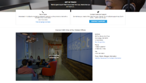
This does not mean a simple phone number and address. No, we’re talking the works. Give them a disclosure so comprehensive it makes WikiLeaks look soft. Take, for example, Hubspot’s ‘All Numbers and Locations’ page which can be accessed at the very top of their header – the first thing you see when you enter every page of their website.
Their contact page is so detailed, it features not just addresses to every one of their offices, but pictures, a direct link to each of the locations’ Google Maps, AND written directions which include detailed parking instructions. They’ve also dedicated an entire section to the phone numbers of each location, along with fax numbers, sales contacts, and a separate page in honor of their Press, Media and Blogger’s contacts. Short of Brian Halligan’s (CEO) home address, they’ve left nothing to their customers’ imaginations.
So why turn a phone number and address kind of situation into a full blown exposure? Because if you can further your company’s credibility points, DO IT. Much of what makes a company reliable is its willingness to be forthcoming and approachable. Withholding anything, even if it is just a fax number, can be the difference between a purchase and a drop off.
Your address page may not be able to convince them that your product is great, but in terms of company principles, it will speak volumes.
4. Pop Up Talk:
Like the co-worker with a car who lives in your neighborhood, a pop up can come at just the right moment to make your customer’s journey just a bit easier. However you may feel about pop ups, there ARE ways to give them emotion and personalization. Unfortunately, it’s not as simple as generating a basic trigger and letting it fly.
Important: A pop up notification of some sort should be a win for your company’s conversion rates, but this should not come at the detriment of your user experience. Entrepreneur.com, the reigning king of pop-up success stories, increased their sales – yes sales – by 162%, subscriptions by 86 % and the way they did it isn’t as complicated as you might think.
Entrepreneur.com saw that pop-up notifications of some sort, when personalized to your customers specific profile, can actually be extremely beneficial not just to them, but to their website visitors as well. They followed the rule of quality over quantity which essentially says, ‘Don’t just send pop ups (notification, lead form, etc.) to everyone and their grandmothers.’ Make assertive and intentional pop-up guidelines and use your website visitor current activities as your baseline.
For example, if a potential visitor enters your website after ditching your cart three days prior and you are (hopefully) looking to send a pop up that recognizes your visitors history with your sales funnel, the last pop up you’re going to send is one asking them to rate their buyer’s experience. They haven’t even used your product, let alone completed the purchase process.
Your pop ups should be an extension of your company’s mission. Target your visitors based on the relationship they have with your brand and ask them to interact in ways that they’ve shown to be comfortable with.
Learn more about A.I.-driven reactions.
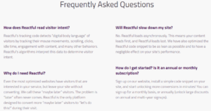
5. FAQs:
The Frequently Asked Questions page may be the most underrated element in website history. With its dry, stark nature and its usual home at the bottom of the page, the FAQ link seems more, ‘because everyone else does it,’ than a bold statement. However, the FAQ page is actually your company’s chance to say, not sell, your product as it is.
I recently came across an article published to Sales Lion titled, “Why Your Website Must Have a “Who We Are Not A Good Fit For” section. Naturally this caught my eye. While I can agree with the idea of seeming subversive, honest, and not-so-salsy, anything negative on a business’s site makes me wary.
The more I got to thinking about this concept, I realized that many websites DO have a variation of a, ‘this is us, take it or leave it’ page. They have FAQs.
The FAQ page of your website is the place for you to plainly answer the myriad of questions that your customers always ask. Of course it doesn’t hurt to add some pizazz here and there, but the main idea behind the FAQ page is a basic and clear telling of who you are, what you do, and what your customers might want to know. Susan Greene Copywriter described FAQs as, ‘likely to reduce the number of pesky inquiries you get asked about routine matters.’
This is the page where you are trying to make the customer experience easier by giving it to them short and sweet. It’s your time to drop the sales act. A lot of people will enter your site with confusions, and a lot of these people will have the same questions as one another. The FAQ page is the place to shout, ‘THIS IS US.’
This may seem in opposition to the idea of getting them to click buy, but much like the “Who We Are Not a Good Fit For” page, FAQ’s have the ability to weed out those who just won’t want what your product is offering and to captivate the guests who have been searching for exactly what you have.
Conclusion
Getting your sign up for a demo, request more info or purchase button clicked can seem like the chore that will NOT end and especially when battling against a industry of products much like your own.
What a sale or achieving your digital goals comes down to is much more than a product or feature. The elements in the list above are the standard aspects of almost every webpage that can actually have a huge impact on your guests visit.
Your site is where potential and returning customers come to feel heard and be taken care of. To create a space where your guests can move easily and access information based on their intent takes much more than just good UX.
The happy truth about the seemingly impossible mission of capturing each guests’ intent is that the devil is in the details and the details already exist on most standard sites. Heed each of the elements above, and watch your engagement, conversions and sales rise.